
Hurst Cycle Analysis:
Mastering Spectral and Phasing Techniques
Introduction
Welcome to a deep dive into the “DNA” of the market. Most traders look at a chart and see chaos, but there is a hidden mathematical heartbeat under every price move. By breaking down J.M. Hurst’s secret weapons—Spectral Analysis and Phasing—we take the first step toward predicting market turns before they happen.
This guide explores how to identify dominant rhythms using Fourier Transforms and visual scans on the Dow Jones. By integrating Hurst’s Principle of Variation, you will learn to determine the precise timing of market troughs with exactitude. Building your own Nominal Model is the ultimate way to transform market chaos into a calculable roadmap. Master the tools that define strategic entries and exits
The Concept of the Hurst Cycle Analysis
Spectral Analysis is the ‘scan’ that finds the strongest rhythms.
Manual vs. Excel:
You can perform the spectral analysis by hand with a pencil and a ruler, or use the power of Excel to run a Fourier Transform. I’ll show you how both work to give you a clear map.
What is the Phasing Analysis?
Phasing Analysis is about finding the ‘troughs.’ It’s like timing the swing of a pendulum.
Let start by The Spectral Analysis
“Imagine the stock market is a wall of noise. Spectral Analysis is like turning a radio dial. As you turn the dial, you are scanning different frequencies. Suddenly, at ‘102.5 FM,’ the music comes in clearly. In the market, we ‘scan’ different day-lengths. If we scan ’20 days’ and the signal is very strong, we’ve found a dominant cycle. We are looking for the ‘loudest’ cycles in the noise.”
How to do it manually: The “Visual Scan”
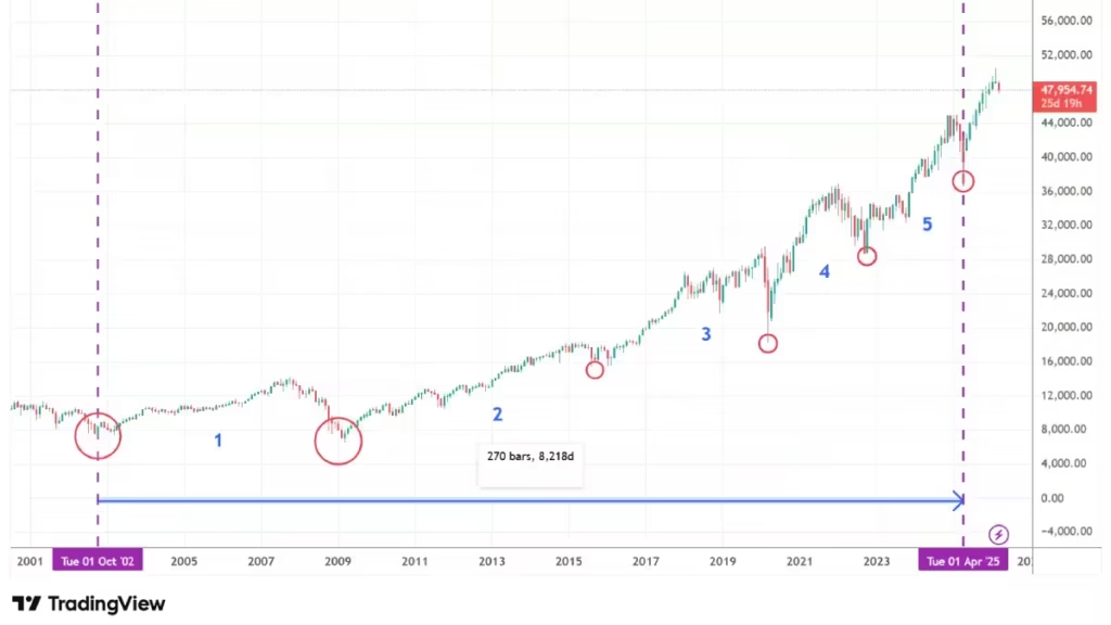
To do this on a chart without a computer, we going to use the Dow Jones Industrial Average chart starting from the year 2000.
Pick a clear low (trough):
From the far left, we are looking for a significant bottom. In this case, the first low formed in 2002 circled in red.
Then we have to Identify the next major lows by following the chart all the way to the most recent important low, which occurred in April 2025.
Calculate the duration:
We need to find the time between those two dates. In today’s case that is 23 years, 2025 minus 2002 =23 years.
Then we go back to the first trough and count how many lows occurred between those dates, and we divide the total time by the number of lows, starting by the 2009 low all the way to 2025, we have 5 major lows, we take the total time: 23 years and divided by the 5 major lows, which give a 4.6-year cycle (or 55.2 months).
We have now identified a potential 55.2-month cycle. Hurst suggests that except for the 54-month and 18-month cycles (which share a 3:1 ratio), all other cycles follow a 2:1 ratio. Therefore, after identifying the 55.2-month cycle, the next logical cycles to look for are 18.4 months, 55.2 divide by 3=3 18.4 months, for the next shorter cycles we will apply the 2:1 ratio, we will looking for the 9 months cycle which is the equivalent of 40 weeks (36 weeks), 20 weeks, and so on.
Since the cycles may vary in length from time to time, and to make easy, there is a rule of calling the 36 week cycle as 40 week, the 18 week as 20 weeks and so on.
Spectral Analysis is simply the act of marking which of those lengths “hits” the lows consistently. The ones that hit most often are your Dominant Cycles.
How to do it in Microsoft Excel: The “Data Scan”
In Excel, we let the software do the “tuning” for us:
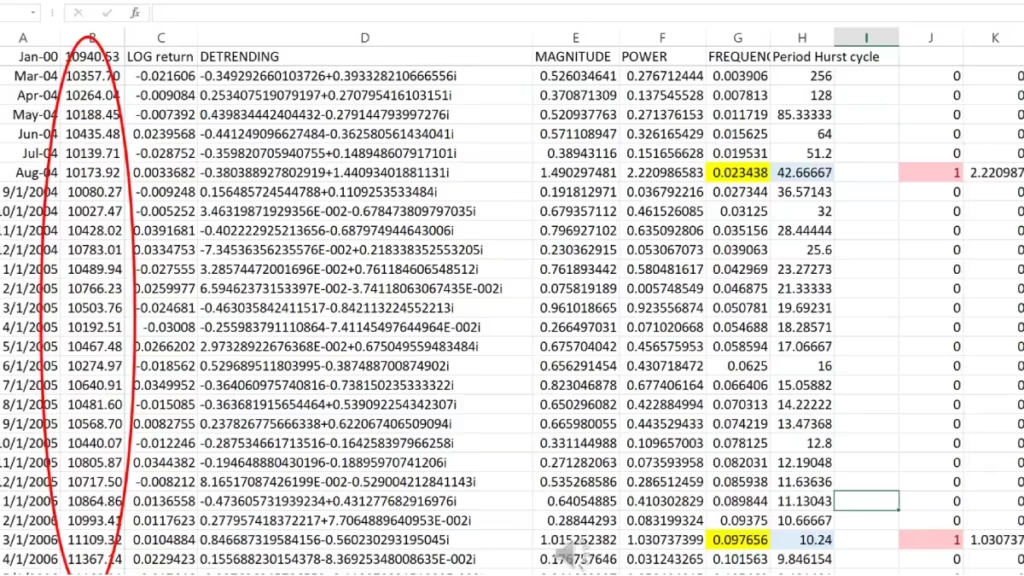
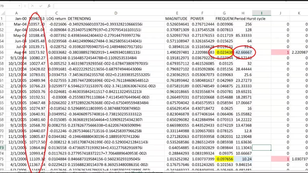
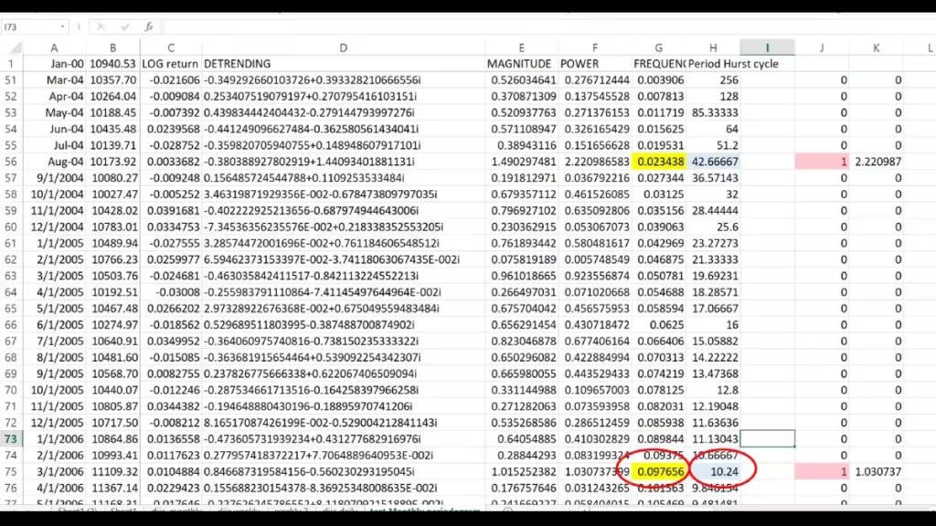
Put your closing prices in Column B.
Use the “Data Analysis” Add-in at the top right and select Fourier Analysis. This tool performs a Fast Fourier Transform , mathematically breaking the price into a list of different frequencies.
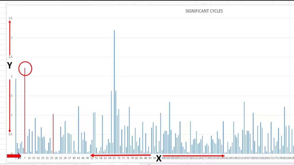
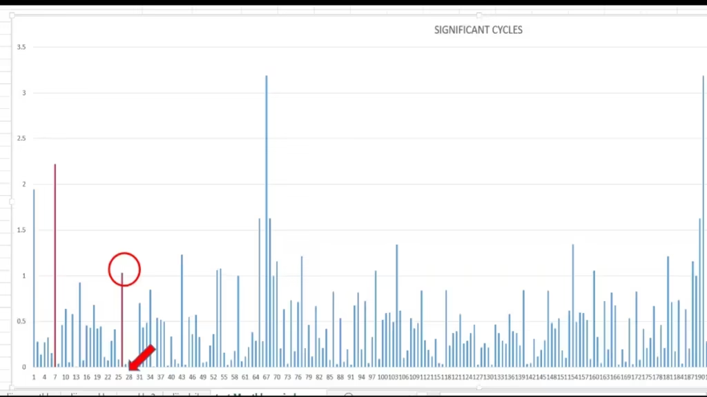
Excel will provide a list of “Complex Numbers.” When you graph these numbers, you get a Periodogram (a chart with spikes).
How to read the Periodogram:
The Horizontal Axis (X) is the Frequency.
The Vertical Axis (Y) is the Power or Magnitude.
Find the highest peak and look at the frequency value under that spike.
Locate that same frequency in your spreadsheet’s frequency column.
Look at the value in the next column: The Period Column.
Examples:
On my periodogram, we see a spike at frequency 7 (the red column). In the spreadsheet, I look for the corresponding frequency in the yellow cell. The value in the blue cell (Period) is 42.66, meaning we found a 42.66-month cycle.
A second example is at frequency 26. The spike corresponds to a frequency of 0.097. Next to it, the period value is 10.24, representing a 10.24-month cycle (the equivalent of 40 weeks).
Now, let’s dive into Part 2: The Phasing Analysis (The ‘When’).
Spectral finds the ‘What,’ but Phasing finds the ‘When.’
Together, they create your trading map. Once we know the cycle length is 80 days, we switch to Phasing to see exactly where we are in that journey. Are we at Day 10 (rising) or Day 75 (about to crash)?”
The Synergy:
You can’t phase a cycle you haven’t discovered yet, and you can’t trade a discovery you haven’t phased.
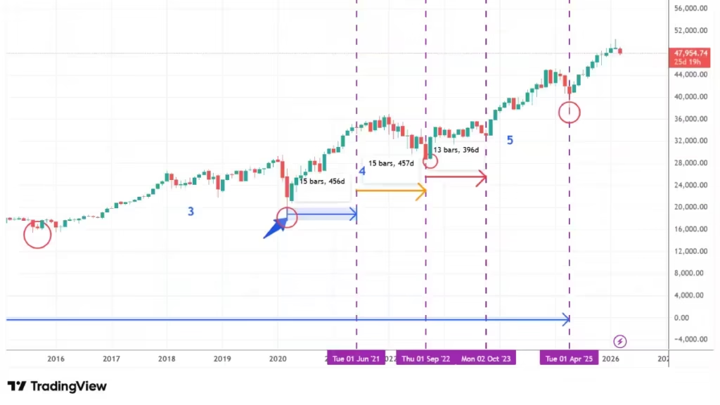
Using our Dow Jones Industrial Average chart and the excel spectral analysis result, we identified the 42.66-month cycle as dominant.
With the blue arrow, let’s label the first low in March 2020 .
From there, we look for the next shorter cycle lows. The next shorter cycle is 14.22 months (42.66 months divide by 3). On manually spectral analysis the monthly cycle was 18.4 months. Only 4.18 months difference compare to the excel version.
We now going to identify the next potential 42.6 month cycle by Counting forward the next 3 shorter cycles:
- from March 2020 to June 2021 (15 months)
- September 2022 (15 months)
- October 2023 (13 months)
Applying Analysis to Future Trading
Hurst established the Principle of Variation, meaning cycles vary in length. They may run longer in a bear trend or shorter in a bull trend. To remain as accurate as possible, it is crucial to recalculate the average length each time a cycle ends.
This is vital for building the FLD (Future Line of Demarcation), which we will cover in the next video.
My Calculation Method:
- Monthly Timeframe:
I average the last three 18-month cycles. In our chart, the lengths were 15, 15, and 13 months. 43 divide by 3 = 14.33 months.
- This means our current 18-month cycle is averaging 14.33 months, we will use this new 14 months cycle for the next phasing, I will look for the next three potential 14.33 low until my longer cycle is completed , then I will recalculate my next 18 month cycle.
Why averaging only 3 cycles? Because that equals the length of the next longer cycle, the 54-month cycle, information from 9 years ago is too old to be relevant for today’s trend.
Weekly and Daily Timeframes:
On the weekly and daily timeframes, I use the last six cycles to calculate the new average, then project that average into the future to find the next potential low .
Conclusion
Mastering Spectral and Phasing Analysis is the difference between guessing where the market might go and calculating where it is mathematically programmed to turn. By identifying the Market DNA, you gain a professional edge that most retail traders never see. Remember, cycles are dynamic—staying synchronized requires consistent recalculation.”
Join the Cycle Community
- Take Action: Have you tried running a Fourier Analysis in Excel yet? Let me know in the comments below what dominant cycles you’ve discovered in your favorite assets.
- Stay Updated: Don’t miss our next deep dive into the FLD (Future Line of Demarcation).
Discover more from tradingmarketcycles
Subscribe to get the latest posts sent to your email.