

Mastering Technical Analysis:
Chapter 1: Fundamentals of Technical Analysis (Part 2)
– Basic assumptions of technical analysis
-Types of charts and their significance
– Time frames in technical analysis
– The role of volume
– Price action basics
The Assumptions of Technical Analysis: Foundations of Price Prediction
At the heart of technical analysis lie three foundational assumptions that shape its methodology and distinguish it from other forms of market analysis.
These assumptions form the bedrock upon which traders build their strategies, providing a framework for interpreting price movements and making predictions about future trends.
While these assumptions may seem straightforward, they carry profound implications for how technical analysts view the market and interact with it.
1. Markets Discount Everything
As mentioned last week, the first and most fundamental assumption of technical analysis is that all known information—whether related to fundamentals, economic conditions, political events, or investor sentiment—is already reflected in the price of a security.
This concept aligns closely with the Efficient Market Hypothesis (EMH), which suggests that asset prices fully incorporate all available information at any given time.
However, unlike the EMH, which implies that it’s impossible to consistently outperform the market, technical analysis takes a more practical approach.
It acknowledges that while prices may not always be perfectly efficient, they still represent the collective wisdom of all market participants.
This assumption means that technical analysts focus exclusively on price action and related data, such as volume, rather than delving into balance sheets, earnings reports, or macroeconomic indicators.
For instance, if a company announces better-than-expected earnings, fundamental analysts would scrutinize the details of the report, while technical analysts would observe how the market reacts to the news through price movement.
If the stock price surges following the announcement, technical analysts interpret this as a bullish signal, regardless of the underlying reasons.
This approach simplifies decision-making by eliminating the need to process vast amounts of external information, allowing traders to concentrate on what matters most: how the market is currently valuing the security.

2. Prices Move in Trends
The second assumption posits that price movements are not random but tend to follow identifiable trends over time.
This principle is rooted in human psychology and behavioral economics, as market participants often exhibit herd-like behavior, creating momentum in price movements.
Trends can take various forms—upward (bullish), downward (bearish), or sideways (consolidation)—and technical analysts believe that once a trend is established, it is more likely to continue than to reverse abruptly.
Understanding this assumption is critical for traders, as it underpins many technical analysis tools and strategies.
For example, trend lines are commonly used to visualize and confirm the direction of a trend, while moving averages help smooth out price fluctuations to reveal underlying patterns.
When a stock is in an uptrend, characterized by higher highs and higher lows, traders might look for buying opportunities, anticipating that the upward momentum will persist.
Conversely, during a downtrend, marked by lower highs and lower lows, traders may seek opportunities to sell or short the stock.
By recognizing and respecting trends, traders can align their strategies with the prevailing market sentiment, increasing the probability of successful trades.

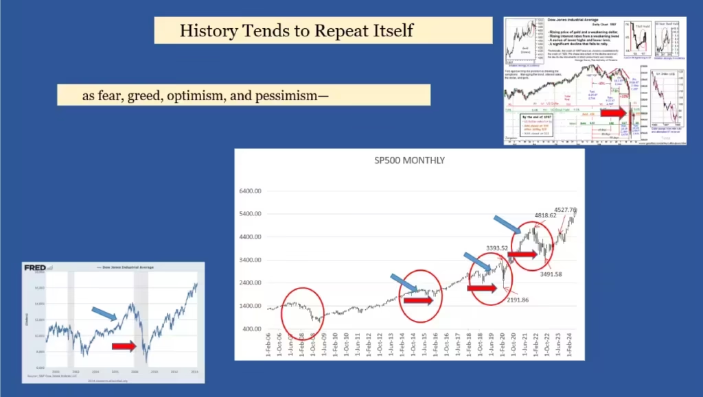
3. History Tends to Repeat Itself
The third assumption of technical analysis is perhaps its most controversial yet intriguing: history tends to repeat itself in the financial markets.
This idea stems from the observation that human emotions—such as fear, greed, optimism, and pessimism—play a significant role in driving price movements.
Because human nature remains relatively constant over time, similar patterns and behaviors tend to recur in different market cycles.
This assumption is the basis for many technical analysis tools, such as chart patterns (e.g., head and shoulders, double tops, and triangles) and candlestick formations (e.g., doji, hammer, and engulfing patterns). For example, a “head and shoulders” pattern, which typically signals a reversal from an uptrend to a downtrend, has been observed repeatedly across different markets and timeframes.
Traders who recognize this pattern can use it as a signal to exit long positions or prepare for a potential decline.
Similarly, candlestick patterns provide insights into market sentiment, helping traders anticipate shifts in momentum or volatility.
Critics of this assumption argue that markets are too complex and dynamic for history to repeat itself with precision.
While it’s true that no pattern guarantees a specific outcome, technical analysts counter that these recurring formations offer probabilistic edges rather than certainties.
By combining historical patterns with other indicators and risk management techniques, traders can enhance their decision-making processes and improve their chances of success.
Implications for Trading Decisions
These three assumptions collectively shape how technical analysts approach the market.
By accepting that markets discount everything, traders can focus on price action without being overwhelmed by external noise.
The belief in trending markets encourages them to ride momentum rather than fight it, while the notion that history repeats itself provides a foundation for identifying high-probability setups.
Together, these assumptions create a coherent framework that guides traders in interpreting market behavior and executing trades with confidence.
However, it’s important to note that technical analysis is not infallible.
Markets can experience sudden shocks, irrational exuberance, or prolonged periods of consolidation that defy traditional patterns.
Therefore, while these assumptions provide valuable insights, they should be applied with caution and complemented by sound risk management practices.
Ultimately, the effectiveness of technical analysis depends on how well traders understand and adapt these principles to real-world market conditions.

Types of Charts in Technical Analysis and Their Significance
In technical analysis, charts serve as the primary visual tools for interpreting price movements and identifying trading opportunities.
Each type of chart offers unique insights into market behavior, catering to different analytical needs and trading styles.
Understanding the distinctions between line charts, bar charts, candlestick charts, point-and-figure charts, renko, Heikin Ashi and so many others type of charts is essential for selecting the right tool for your analysis and maximizing its effectiveness.
Today we will stay with the 4 most common charts.
Line Charts: Simplicity and Clarity
Line charts are the most basic and straightforward type of chart used in technical analysis.
They plot a single data point—typically the closing price—for each time period and connect these points with a continuous line.
This simplicity makes line charts ideal for beginners or traders seeking a quick overview of price trends without the distraction of additional details.
The significance of line charts lies in their ability to highlight long-term trends and filter out short-term noise.
Since they only display closing prices, they eliminate intraday fluctuations, providing a clearer picture of overall market direction, can also be used to confirm a new high, for example on the bar chart the market made a new high, but on the line chart using the closing price, the market didn’t made a new high, there is a divergence between both and could signal a possible change in trend.
For example, a steadily rising line chart indicates an uptrend, while a declining line suggests a downtrend. However, line charts lack granularity, as they do not show opening prices, highs, lows, or intraday volatility.
As a result, they are less suitable for detailed analysis or short-term trading strategies.
Pros:
– Simple and clean presentation
– Easy to identify overall trends
– Good for beginners
– Less noise in data
– Best for long-term trend analysis
Cons:
– Shows only closing prices
– Missing important intraday information
– Limited trading signals
– No volume information
– Cannot identify price gaps

Bar Charts: Comprehensive Data Representation
Bar charts, also known as OHLC (Open, High, Low, Close) charts, offer a more detailed view of price action by displaying four key pieces of information for each time period: the opening price, the highest price, the lowest price, and the closing price.
Each bar consists of a vertical line representing the range between the high and low, with small horizontal lines extending to the left (opening price) and right (closing price).
The significance of bar charts lies in their ability to provide a complete snapshot of price movement within a given timeframe.
This makes them particularly useful for identifying volatility, gaps, and intra-period trends.
For instance, a long vertical line indicates high volatility, while a short line suggests low volatility.
Additionally, the position of the opening and closing prices relative to the high and low can reveal market sentiment.
A bar with a closing price near the high suggests bullishness, while a closing price near the low indicates bearishness.
Bar charts are widely used by intermediate and advanced traders who require more information than line charts can offer but prefer a less visually complex format than candlestick charts.
Pros:
– Shows four price points
– Good price detail
– Easy to read
– Shows trading ranges
– Can identify gaps
Cons:
– Can be cluttered in busy markets
– More complex than line charts
– May overwhelm beginners
– Takes more space
– Less visually appealing

Candlestick Charts: Visual Storytelling of Price Action
Candlestick charts are among the most popular and visually intuitive tools in technical analysis.
Like bar charts, they display the open, high, low, and close for each time period, but their design emphasizes price relationships through color-coded “candles.” Each candle consists of a body (the range between the open and close) and wicks (the lines extending above and below the body, representing the high and low).
The significance of candlestick charts lies in their ability to convey both quantitative data and qualitative insights into market psychology.
The color of the candle—often green or white for bullish candles (close higher than open) and red or black for bearish candles (close lower than open)—provides an immediate visual cue of market sentiment. Moreover, specific candlestick patterns, such as doji, hammer, and engulfing patterns, offer predictive signals about potential reversals or continuations in price trends.
For example, a hammer candlestick, characterized by a small body and a long lower wick, often signals a potential bullish reversal after a downtrend.
Candlestick charts are particularly favored by short-term traders and those who rely heavily on pattern recognition to inform their trading decisions.
However some candlestick have to be used in combination with other ones,
Pros:
– Shows price direction and momentum
– Easy to identify patterns
– Clear visual representation
– Strong psychological signals
– Rich historical background
Cons:
– Can be complex for beginners
– Requires pattern knowledge
– Can look cluttered
– May cause information overload
– Pattern interpretation subjective

Point-and-Figure Charts: Focusing on Price Movements
Point-and-figure charts differ significantly from the other chart types in that they focus exclusively on price movements, ignoring time and volume.
These charts consist of columns of Xs (representing upward price movements) and Os (representing downward price movements), plotted on a grid based on predefined price increments called “box sizes.”
The significance of point-and-figure charts lies in their ability to filter out minor price fluctuations and highlight major trends and support/resistance levels.
By removing the time element, these charts allow traders to concentrate purely on price action, making them especially useful for identifying long-term trends and key turning points.
For example, a series of ascending X-columns indicates a strong uptrend, while descending O-columns suggest a downtrend.
Point-and-figure charts are often used by traders who prioritize clarity and simplicity, as well as those who employ trend-following or breakout strategies.
Pros:
– Focuses on price movement
– Filters out minor price movements
– Clear support/resistance levels
– Eliminates time factor
– Good for identifying breakouts
Cons:
– Difficult to understand initially
– No time scale
– Limited volume analysis
– Not widely used
– May miss important price action
Choosing the Right Chart for Your Needs
The choice of chart type depends on the trader’s goals, preferences, and trading style.
Line charts are best suited for beginners or those analyzing long-term trends, while bar charts and candlestick charts provide the depth needed for intraday or swing trading.
Point-and-figure charts excel in filtering noise and identifying significant price levels, making them ideal for trend-focused strategies. Regardless of the chart type, the key is to select one that aligns with your analytical objectives and enhances your ability to interpret market dynamics effectively.
By mastering the strengths and limitations of each chart type, traders can build a robust technical analysis toolkit that supports informed decision-making and improves trading outcomes.

Understanding Different Time Frames in Technical Analysis
Technical analysis in the stock market involves studying past market data, primarily price and volume, to forecast future price movements.
One of the key aspects of technical analysis is the use of different time frames to analyze stock price trends.
Time frames can range from minutes to months, and each provides unique insights into market behavior. Here’s a detailed look at the various time frames used in technical analysis and their significance.
1. Intraday Time Frames
Intraday time frames are used by day traders who aim to capitalize on short-term price movements within a single trading day. Common intraday time frames include 1-minute, 5-minute, 15-minute, and 30-minute charts. These charts are highly detailed and capture every price movement, making them ideal for identifying short-term trends and entry/exit points. However, they can also be noisy and prone to false signals due to the high level of market volatility.
2. Daily Time Frames
Daily charts are widely used by swing traders and position traders. Each candlestick on a daily chart represents one trading day. These charts provide a broader view of the market, helping traders identify medium-term trends and key support and resistance levels. Daily charts are less noisy compared to intraday charts, making them more reliable for trend analysis.
3. Weekly Time Frames
Weekly charts are used by long-term traders and investors. Each candlestick on a weekly chart represents one week of trading. These charts help in identifying long-term trends and major support and resistance levels. Weekly charts are less affected by short-term market fluctuations, providing a clearer picture of the overall market direction.
4. Monthly Time Frames
Monthly charts are used for long-term investment analysis. Each candlestick on a monthly chart represents one month of trading. These charts are ideal for identifying long-term trends and major market cycles. Monthly charts are the least noisy and provide the most reliable signals for long-term investors.
5. Multiple Time Frame Analysis
Multiple Time Frame Analysis (MTFA) involves analyzing a stock using different time frames to get a comprehensive view of the market. Traders often use a combination of a higher time frame to identify the overall trend and a lower time frame to pinpoint entry and exit points. For example, a trader might use a weekly chart to identify the long-term trend and a daily chart to find the best entry point. This approach helps in aligning trades with the dominant market trend and improving the accuracy of trade signals.
6. Choosing the Right Time Frame
The choice of time frame depends on the trader’s strategy and trading style. Day traders prefer shorter time frames like 1-minute or 5-minute charts, while swing traders might use daily or 4-hour charts. Long-term investors typically rely on weekly or monthly charts. It’s essential to choose a time frame that aligns with your trading goals and risk tolerance.
Understanding and utilizing different time frames in technical analysis is crucial for successful trading. Each time frame offers unique insights and helps traders make informed decisions. By combining multiple time frames, traders can enhance their analysis and improve their trading outcomes.
For a visual representation, you can find charts of different time frames here, here, and here.
The Role of Volume in Technical Analysis
Volume is a critical component of technical analysis in the stock market. It represents the number of shares or contracts traded in a security or market during a given period. By analyzing volume, traders and investors can gain insights into the strength and direction of price movements, as well as potential reversals and breakouts. Here’s a detailed look at the role of volume in technical analysis.
1. Confirming Trends
Volume is often used to confirm the strength of a trend. When a price movement is accompanied by high volume, it indicates strong market participation and suggests that the trend is likely to continue. Conversely, a price movement with low volume may indicate a lack of conviction and could signal a potential reversal. For example, if a stock is in an uptrend and the volume increases, it confirms the strength of the uptrend. On the other hand, if the volume decreases during an uptrend, it may indicate that the trend is losing momentum.
2. Identifying Reversals
Volume can also help identify potential reversals in the market. A significant increase in volume during a price reversal suggests that the reversal is likely to be sustained. For instance, if a stock has been in a downtrend and suddenly experiences a sharp increase in volume along with a price increase, it may indicate that the downtrend is coming to an end and a new uptrend is beginning. Similarly, a decrease in volume during a price reversal may suggest that the reversal is weak and may not be sustained.
3. Breakout Confirmation
Breakouts occur when the price of a security moves above a resistance level or below a support level. Volume plays a crucial role in confirming breakouts. A breakout accompanied by high volume is considered more reliable and suggests that the price movement is likely to continue. Conversely, a breakout with low volume may indicate a false breakout, where the price movement is not supported by strong market participation and is likely to reverse.
4. Volume Patterns
Volume patterns can provide valuable insights into market behavior. For example, a gradual increase in volume during an uptrend suggests a healthy and sustainable trend, while a sudden spike in volume near key support or resistance levels could signal potential reversals. Additionally, volume divergence, where the price is moving in one direction while volume is moving in the opposite direction, can indicate a weakening trend and potential reversal.
5. Market Sentiment
Volume reflects the intensity of market sentiment. High volume indicates strong interest and participation from traders and investors, while low volume suggests a lack of interest and indecisiveness. By analyzing volume, traders can gauge the overall sentiment in the market and make more informed trading decisions.
Volume is an essential tool in technical analysis that helps traders and investors confirm trends, identify reversals, and validate breakouts. By incorporating volume analysis into their trading strategies, market participants can gain a deeper understanding of market dynamics and improve their trading outcomes.
Price Action Basics in Technical Analysis
Price action is a foundational concept in technical analysis that involves making trading decisions based on the movement of prices on a chart, without the use of indicators or other technical tools. By analyzing price action, traders can gain insights into market sentiment and make informed decisions. Here are the basics of price action in technical analysis.
1. Understanding Price Action
Price action reflects the collective behavior of market participants, including buyers and sellers. It is represented by candlesticks, bars, or line charts, which display the open, high, low, and close prices for a given period. By studying these price movements, traders can identify patterns and trends that provide valuable information about potential future price movements.
2. Key Concepts in Price Action
- Support and Resistance Levels:
Support and resistance levels are crucial in price action analysis. Support is a price level where buying pressure is strong enough to prevent the price from falling further. Resistance is a price level where selling pressure is strong enough to prevent the price from rising further. These levels help traders identify potential entry and exit points and make informed trading decisions.
- Trends are the general direction in which prices are moving. An uptrend is characterized by higher highs and higher lows, while a downtrend is characterized by lower highs and lower lows. Sideways or ranging markets occur when prices move within a horizontal range. Identifying trends is essential for making trading decisions based on price action.
- Candlestick Patterns Candlestick patterns are a key component of price action analysis. These patterns provide visual cues about market sentiment and potential price reversals. Common candlestick patterns include:
- Doji: Indicates indecision in the market and potential reversals.
- Hammer and Hanging Man: Suggest potential reversals at the bottom and top of a trend, respectively.
- Engulfing Patterns: Bullish or bearish engulfing patterns signal strong buying or selling pressure and potential trend reversals.
- Chart Patterns Chart patterns are formations created by price movements on a chart. These patterns provide insights into market behavior and potential future price movements.
In a future article I will explore in details the most common chart patterns.
Some of the common chart pattern include:
- Head and Shoulders: Indicates potential trend reversals.
- Double Tops and Bottoms: Suggest potential reversals after a strong trend.
- Triangles: Indicate periods of consolidation and potential breakouts.
3. Trading Strategies Based on Price Action
Price action trading strategies involve making decisions based on the analysis of price movements. Some common strategies include:
- Breakout Trading: Identifying and trading breakouts from support and resistance levels or chart patterns.
- Reversal Trading: Trading potential reversals based on candlestick patterns or trend changes.
- Trend Following: Identifying and trading in the direction of the prevailing trend.
4. Advantages of Price Action Trading
Price action trading offers several advantages, including:
- Simplicity: It relies on price movements and does not require complex indicators.
- Flexibility: It can be applied to any market and time frame.
- Real-time Analysis: Provides real-time insights into market behavior.
Price action is a powerful tool in technical analysis that allows traders to make informed decisions based on the movement of prices. By understanding key concepts such as support and resistance levels, trends, candlestick patterns, and chart patterns, traders can develop effective trading strategies and improve their trading outcomes.
Conclusion
-Types of charts and their significance, time frames in technical analysis, the role of volume and Price action basics are part of an important to understand to be able to build a Technical Analysis Framework in the Stock Market, and successful trading strategy.